Heritage Distilled
THE OBJECTIVE
A revitalized brand identity for Dos Boots Mezcal that captures its cross-cultural roots and generational story while preparing the brand for growth across retail, packaging, and digital platforms. The goal was to evolve its visual language without losing the authenticity that defines its Oaxacan–California origin.
THE SOLUTION
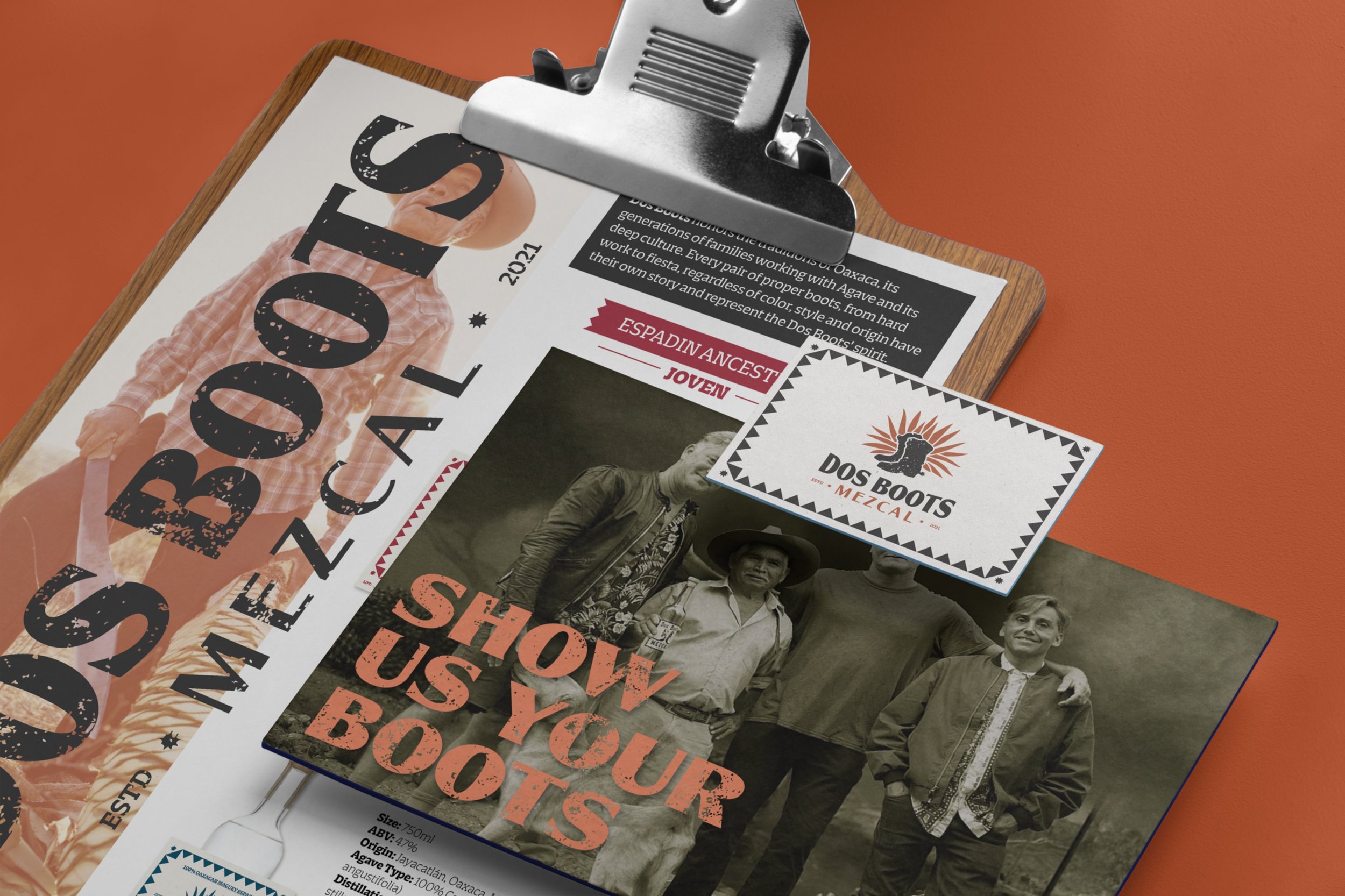
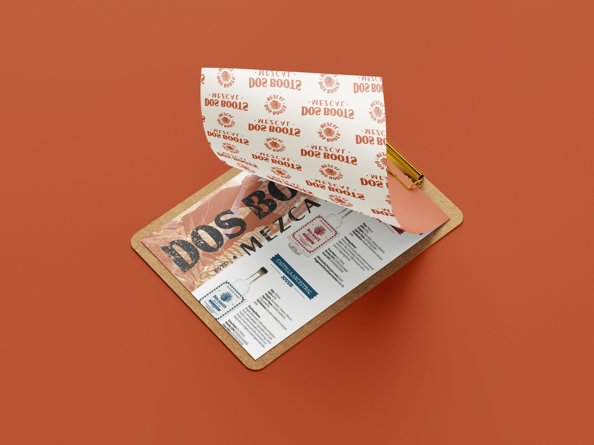
This rebrand centers on a complete logo redesign that more clearly communicates the soul of the brand. Inspired by its bi-cultural heritage and mezcalero traditions, the new identity combines rugged storytelling with modern refinement. The proposal outlines a complete visual system—including a new logo suite, color palette, typography, packaging strategy, and brand patterns—designed to unify the brand across shelf, screen, and storytelling platforms.
DELIVERABLES
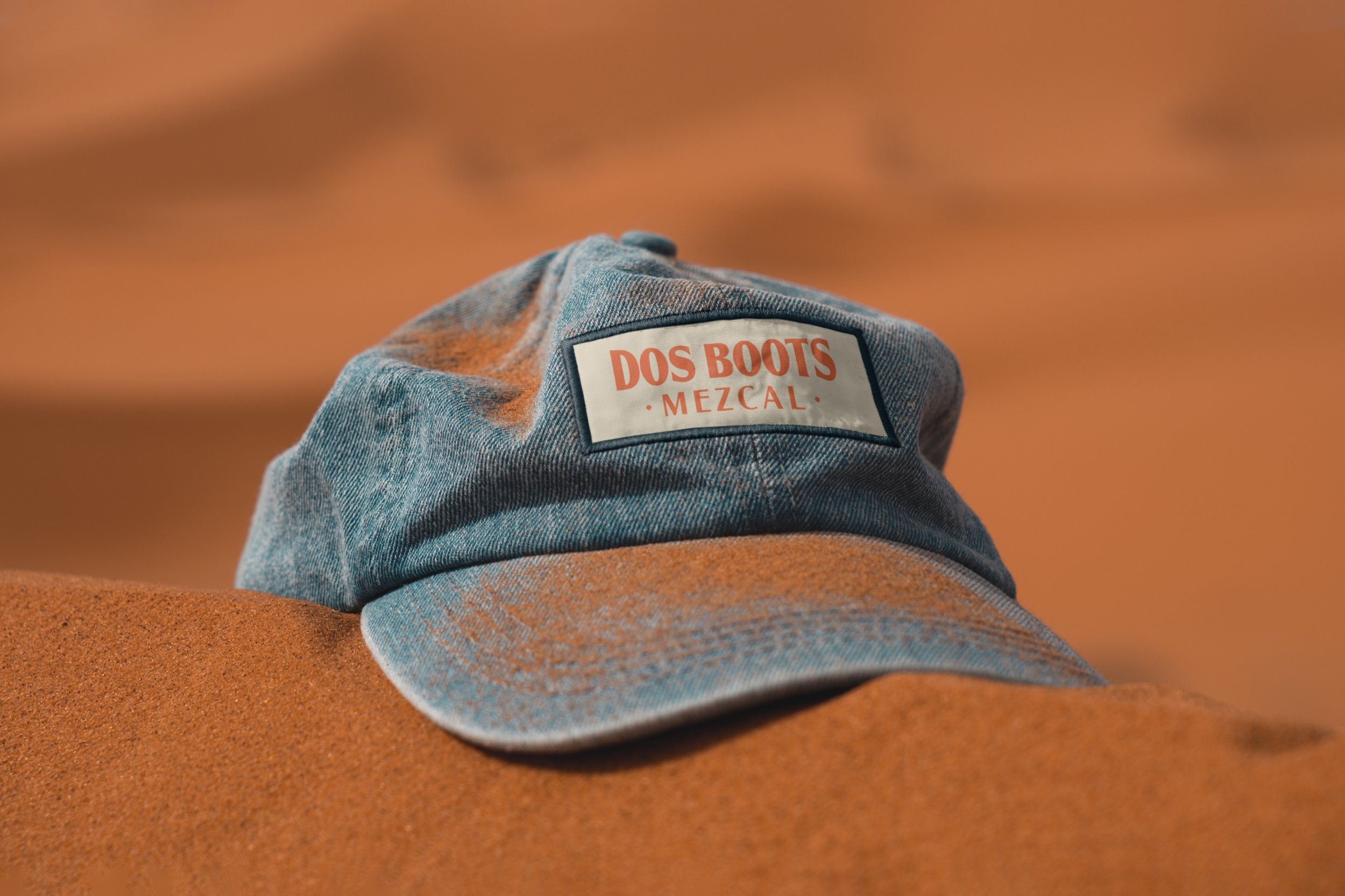
Brand Audit, Visual Identity Concept, Logo Suite, Color Palette, Packaging Direction, Merch & Collateral Concepts

Logo Redesign: Before & After
The original Dos Boots logo featured a pair of rugged cowboy boots with distressed type—capturing a raw, homespun feel but lacking variations for scalability. In redesigning the Primary Logo, I retained the iconic boots to preserve brand recognition but reimagined them within a radiating agave silhouette —grounding the identity in both its mezcal traditions and bi-cultural origin.
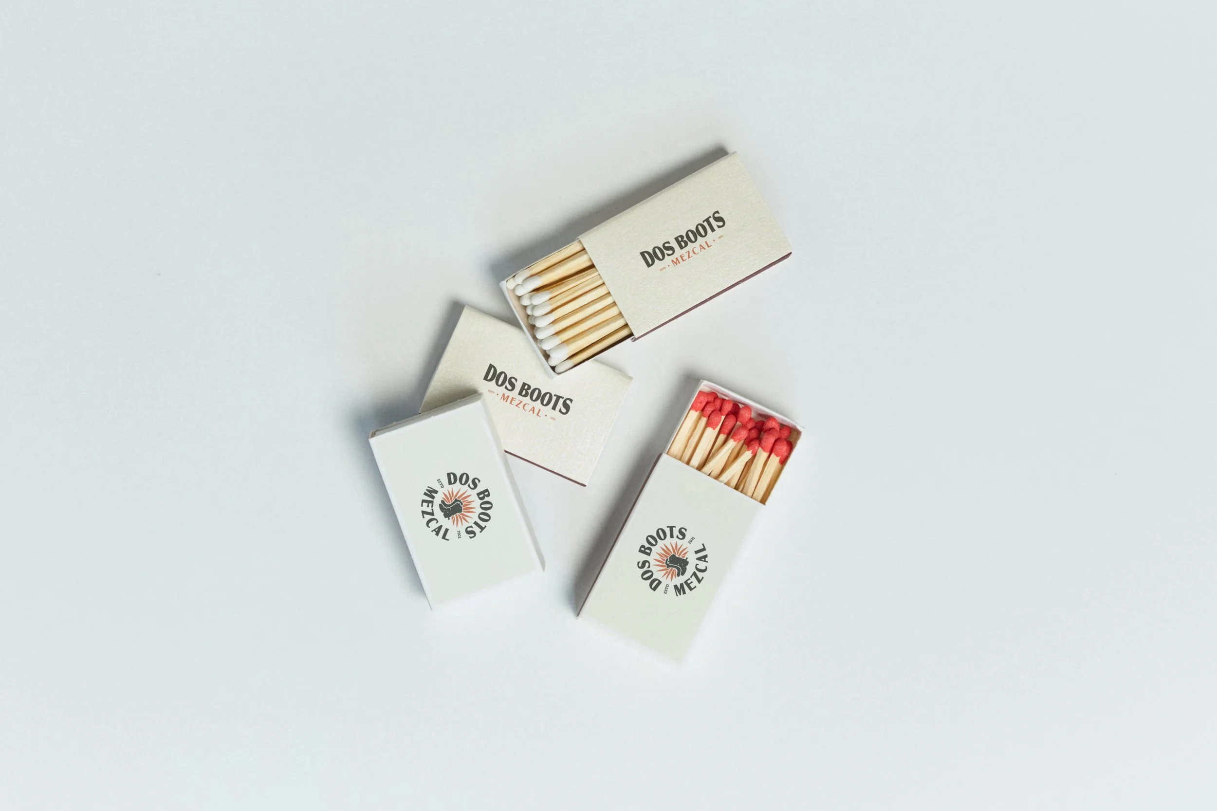
I also introduced a full logo suite, including secondary lockups, wordmarks, badges, and brandmarks, all designed to flex across packaging, merchandise, digital campaigns, and print.


