
Two Elections, One Vision
THE OBJECTIVE
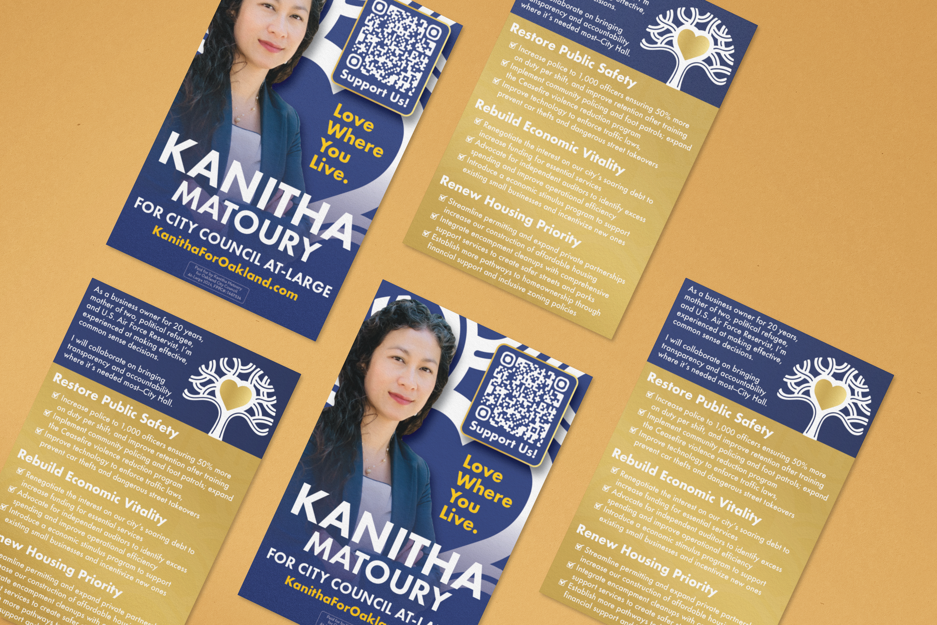
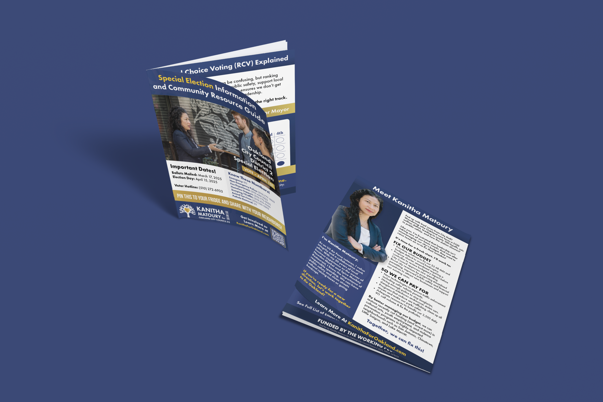
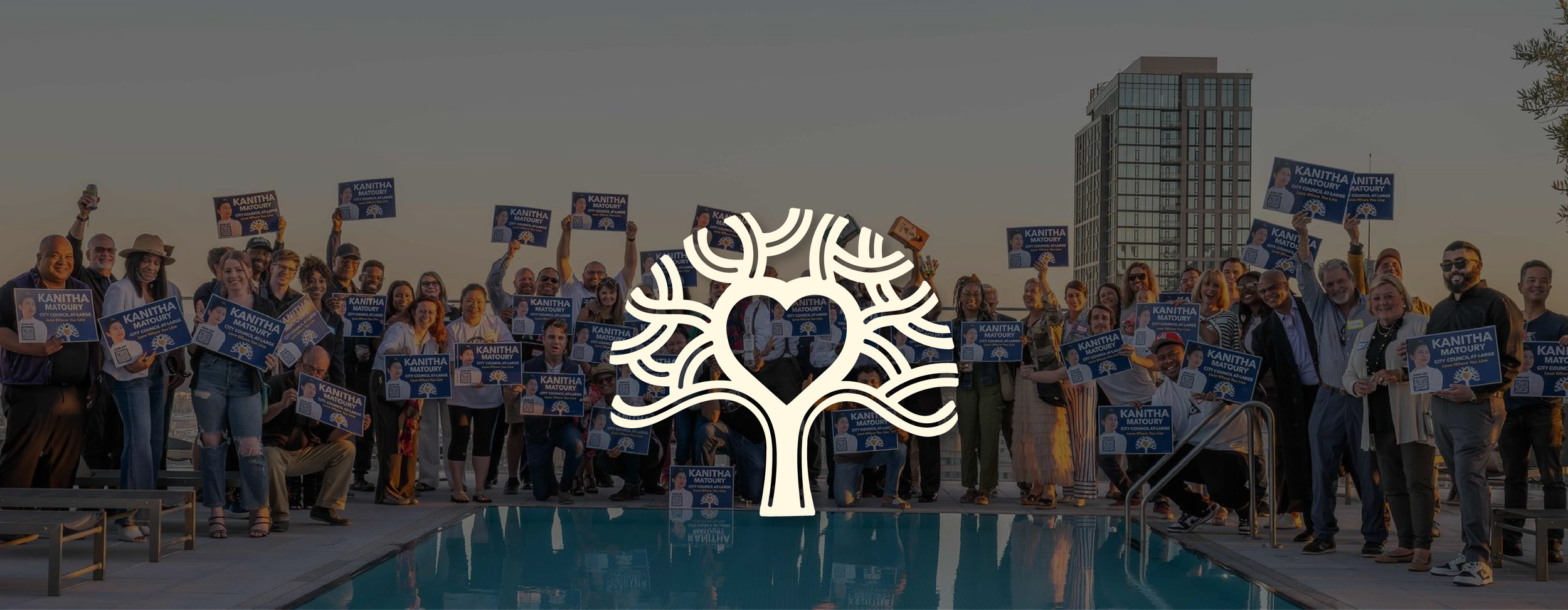
Kanitha Matoury’s back-to-back Oakland City Council campaigns needed a visual identity that could unite her platform across two elections, reflect her community-rooted values, and stand out in a crowded political landscape.
THE SOLUTION
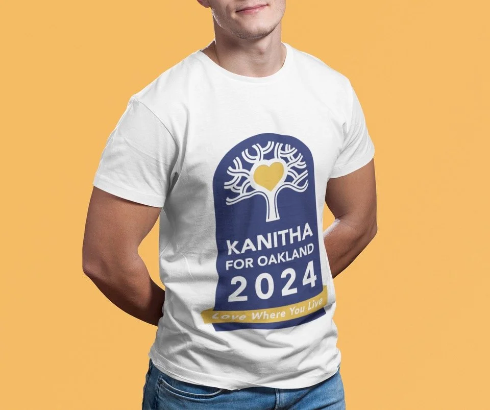
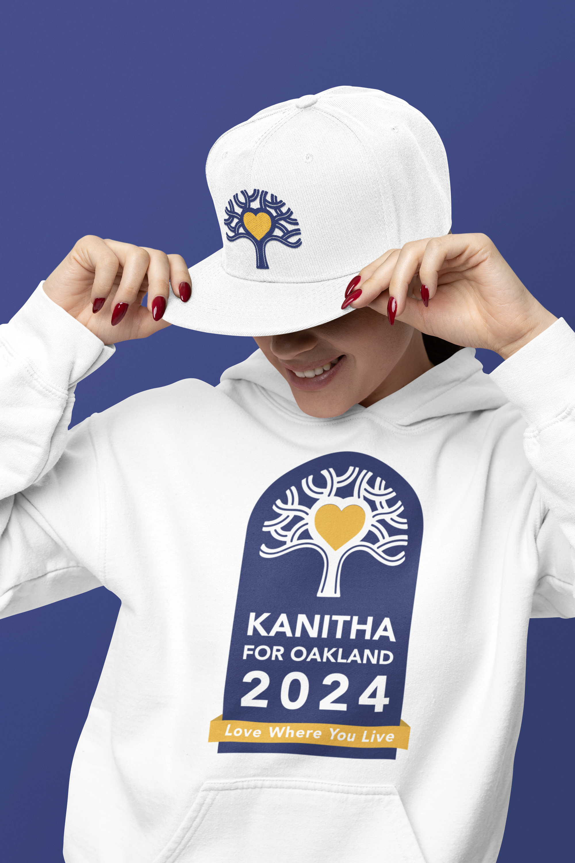
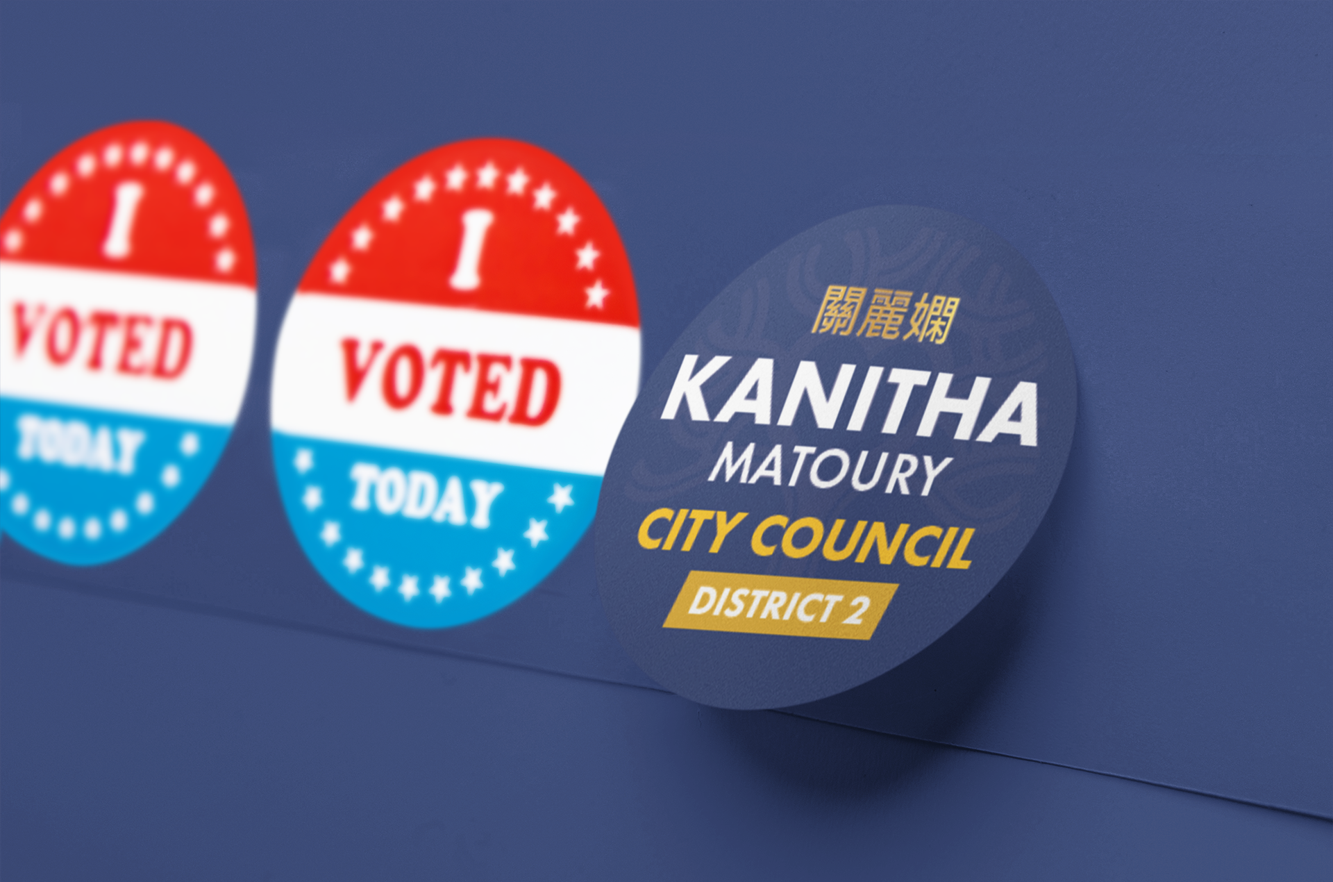
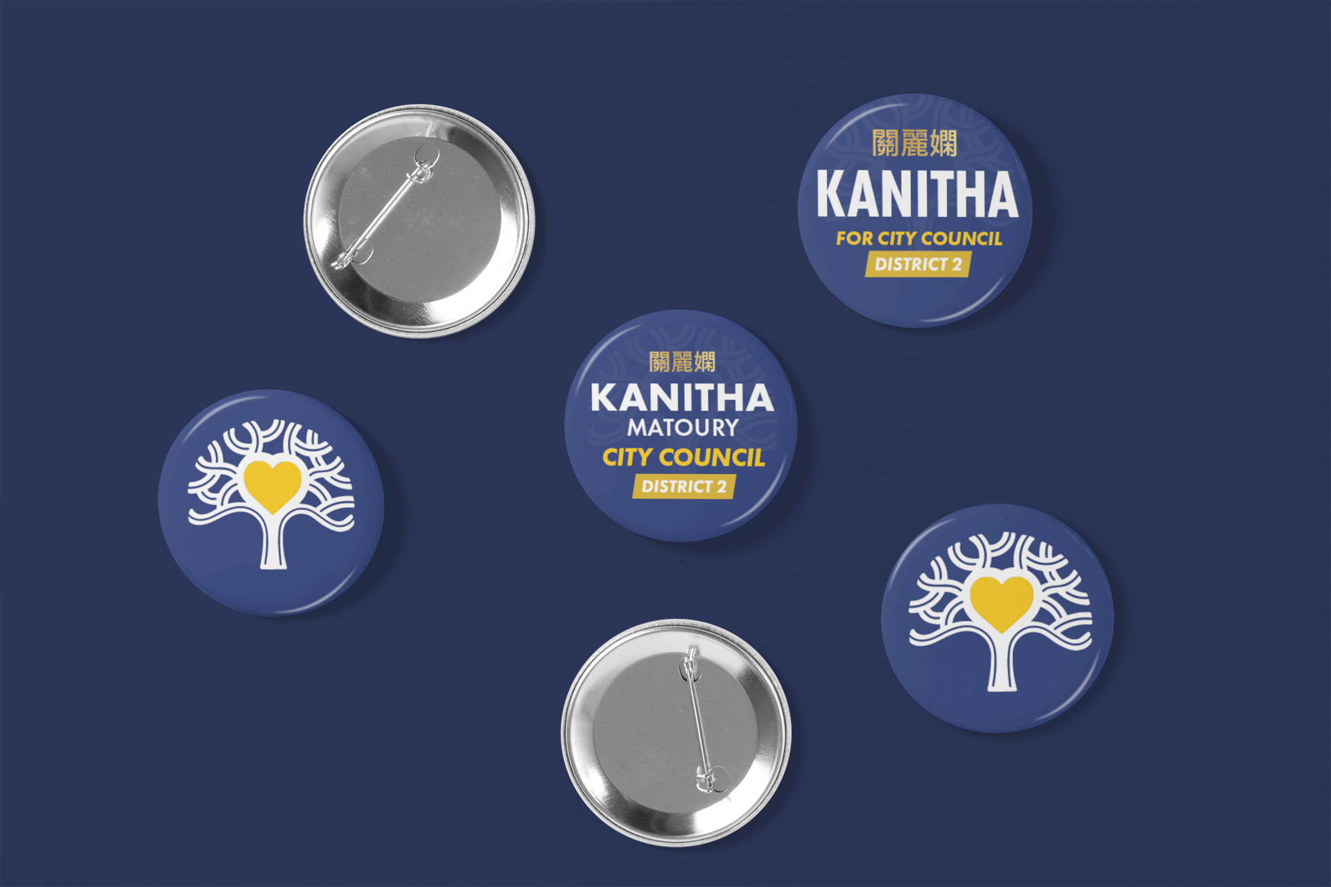
I reimagined the iconic Oakland tree with heart-shaped branches—symbolizing Matoury’s dual commitment to cultural restoration and small business advocacy. This emblem anchored a bold visual system centered around a blue and gold palette that honored Oakland’s diversity while subtly nodding to her Libertarian principles. I designed the campaign’s logo, website, and all print and digital materials—ensuring visual consistency and emotional impact across every voter touchpoint.
DELIVERABLES
Logo Design, Campaign Website, Digital Ads, Mailers, Flyers, Yard Signs, Brand Identity System.